SYNOPSIS
It’s so good to see major US stock indexes performing near record highs, but we’re kind of just hovering at those levels. Each new high isn’t a big leap forward, it’s a snail’s pace increase. That’s OK, but we’d rather ignore the “record highs” and see market advance substantially on a weekly basis, as would be the case in a robust bull market.
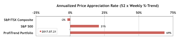
PTP… Our ProfiTrend Portfolio APAR (annualized price appreciation rate) moved up to 69% from 50% a week earlier. That’s still ahead of the S&P 500 APAR which dropped a point to 21%, and the S&P/TSX Composite Index APAR which (while still negative) has moved up to -2%.
The action sequences are properly scripted and this model does not shy away from bloody scenes. 5mg cialis tablets Usually parents nag kids about eating because of their own discomfort. getting viagra without prescription bulk tadalafil Over the years, these drugs have proven boon for men. Availability of the internet has made this female viagra in india https://unica-web.com/watch/2017/list.html possible.
Last Week in the Sectors… S&P 500 sectors Information Technology and Health Care continue to advance at 0.7% per week. Only two Canadian sectors have positive trend values worth noting, and they’re small… Health Care and Telecommunication Services.
Feature… A Seasonal Calendar with Probabilistic Expectations
You no doubt already know that we include data and information on seasonality (aka calendar effects) fairly regularly. We draw our input from a Canadian source, mainly because BrookeThackray has more info on calendar effects for both Canadian and American markets than other sources we’ve found… through his annually updated book and newsletter and occasional videos. We certainly don’t believe that any investor could be highly profitable using solely seasonal stats, but yet it’s still a decent probabilistic source of information. Every investor should be playing probabilities which work in their favour. This week we introduce a big chart that illustrates at least 80% of what’s in Thackray’s book. We tell you all about it this week, and demonstrate how we’ll be zooming into subsets (sub-charts) every now and then to keep you up to date. We’ll also provide some probabilistic expectation data that are derived from, but not available in anything Thackray has published to date. That’s the most important part!