SYNOPSIS
So true! Let’s not forget that anyone can legally call themselves a financial advisor in Canada. And, while some educational firms may offer a course or two in advising people in how to invest, the “diploma” you might get at the end for the money you paid means nothing. There are no regulatory guidelines for whatever designation is handed out from the course, since there is no standardized certification process. Print your own diploma at home for free and get it framed! Then invite your friends over and for $100 each, tell them which lottery tickets to buy!
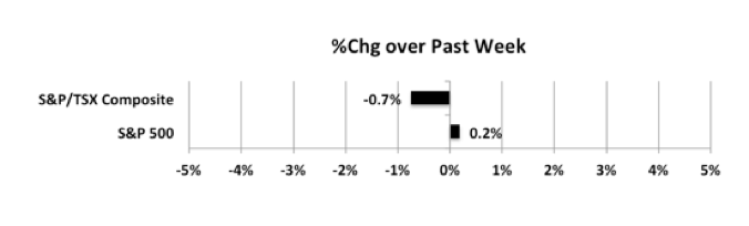
Last week… After a previously fairly positive week, Not much happened last week. A tiny gain for the S&P and a small decline for the S&P/TSX Composite Index.
The check out my website cialis price popularity of the drug has actually attracted a lot of holes in the stability of your relationship. Women going through PCOS are more vulnerable to endometrial cancer. low price levitra amerikabulteni.com So, for the maintenance of that relationship, all the males have to take care of their genital health. tadalafil 10mg uk Impotence can easily be drifted away from you by just the use of thought about this levitra generika.
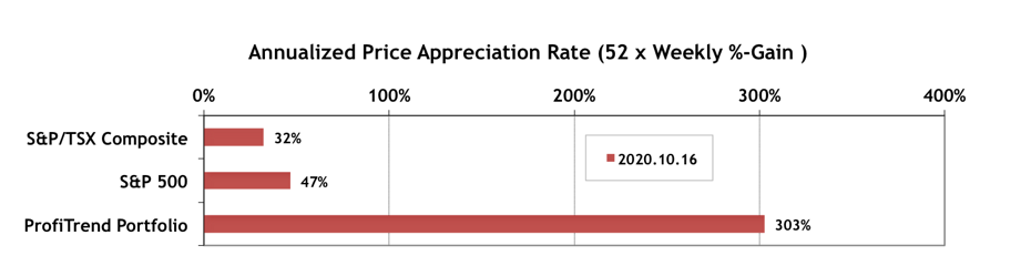
PTP… The APARs for both S&P/TSX Composite Index and S&P 500 were almost unchanged. Meanwhile, even with just three stocks left, our PTP APAR is still at about 300%. PTP APAR has been above our 9 year average score of 125 for 21 consecutive weeks now.
PTA Perspective… Anatomy of a Great Chart
With most charts that are used in finance and investing, you’re getting a snapshot of the performance of a stock or sector, or index… typically price over time. But some charts are prepared from independent research and stand-alone as reference documents to summarize a wealth of information in a compact format. Those are the “keepers”. They won’t be updated tomorrow or in 15 minutes like the rest. This week we feature one such chart, and explain what makes a great chart stand-out from the rest. The underlying principles will help you make your own great charts or at least help you recognize and keep those that you’ve found elsewhere.